
Researching and testing the UX of
settings menus
My roles
UX Researcher & UX Designer
Meet the team
[ +1 ]
Programmer
[ +1 ]
Thesis Advisor
Project timeline
January 2022 - March 2023

User experience for games needs standards.
Could established heuristics help?
For this study, we set out to test the effect of Universal Design principles on the user experience of settings menus in video games. The commercial game,
Super Smash Brothers for Wii U, was our A/B test subject for a panel of 20+ usability testing participants.
Research question
In what ways can the user experience of video game settings menus be improved through comparison with the 7 principles of universal design?
[ 1 ]
Analyze Game
[ 2 ]
Test Game
[ 3 ]
Design Prototype
[ 4 ]
Test Prototype
Turns out… yes!
Research findings show that heuristics work.
"
This feels right.
"
-Interview Participant
"
Pretty much seamless…
Everything is where you would expect.
"
-Interview Participant
"
I'm not sure what this setting does.
"
-Interview Participant
Heuristics guided UX improvements in...
Customization

New customization options provide a more pleasant and flexible experience.
Participant Ratings
Commercial
Game
4 / 9
Prototype
8 / 9
Navigation

With a new menu structure, tasks are now easier and less frustrating to complete.
Participant Ratings
Commercial
Game
5 / 9
Prototype
8.5 / 9
What's next?
Heuristics uncovered specific issues in the interface, which can be addressed with further design and testing.
Identified Pain Points
Visuals & Layout
Info Hierarchy
Function Limits
Guidance
What does this mean for games UX?
Established design heuristics work! With further research, more game development teams could design and launch consistent user experiences with the help of an industry-standard set of heuristics.
Early on in the research process
I created prompts to connect each of
the universal design principles to video game menus.
This thought strategy left me with a set of guiding questions to help search for a test subject with bad UI.
Example
|
Breakdown of the principles
Principle
[ 4 ]
Perceptible Information
Key phrases from description
Communicates effectively
Regardless of ambient conditions or user’s sensory abilities
Guiding questions
Is there confusion about the menu’s content?
Are certain design choices contributing to this confusion?
Using these prompts,
I looked to social media for a test subject.
I found online discussion boards where gamers complained about video game interfaces. The game, Super Smash Bros for Wii U, was mentioned in the most comments across a few different sources. The large amount of complaints I found about this game’s UI made it the obvious pick for the test subject of this study.
Video games
Source Count
7 Principles
1
2
3
4
5
6
7
Black Ops 4
1
X
X
Cyberpunk 2077
1
X
X
Last of Us Part II
1
X
Mass Effect Andromeda
1
X
X
Super Smash Bros for Wii U
3
X
X
X
Metroid Prime 2
1
X
X
Battlefield 2042
1
X
X
Next step
was to choose two principles for design analysis.
Due to project timeline and resource limitations, I chose to focus on two principles that were identified the most in complaints from this research: Simple and Intuitive Use & Flexibility in Use. These principles act as a reference point for the research question in determining the extent to which the user experience of Super Smash Bros for Wii U can be improved.
This process is made easier by looking to the guiding questions and identifying specific components of the two principles. These components are used to categorize the data gathered from usability testing. Essentially- they help to analyze the likes and dislikes of the study participants.
Components
|
Simple and intuitive use
Lacking experience
Consider the player’s prior experience with this interface (or the game franchise) which can either help them out or negatively impact their experience with the game.
Understandable
Consider the simplicity of the player's interactions with the interface and whether it is a straightforward process for them.
Components
|
Flexibility in use
Accommodating
Consider how the player's customization needs are met along with the reasoning behind including these options. In addition, recognize how this flexibility impacts the player.
Customizable
Consider the player's ability (and/or inability) to change settings options according to their individual needs.

By utilizing the A/B testing method,
I could gather user insights on the
effectiveness of these design principles.
This process involved four steps, which included two rounds of testing as well as the development of a low-fidelity prototype.
1
Analysis
[
Commercial Game
]
2
A/B Testing
[
Card Sort
]
[
Interviews + QUIS
]
3
Redesign
[
Prototype
]
4
A/B Testing
[
Interviews + QUIS
]
Focusing the analysis on
audio and gameplay settings.
Screen flows…
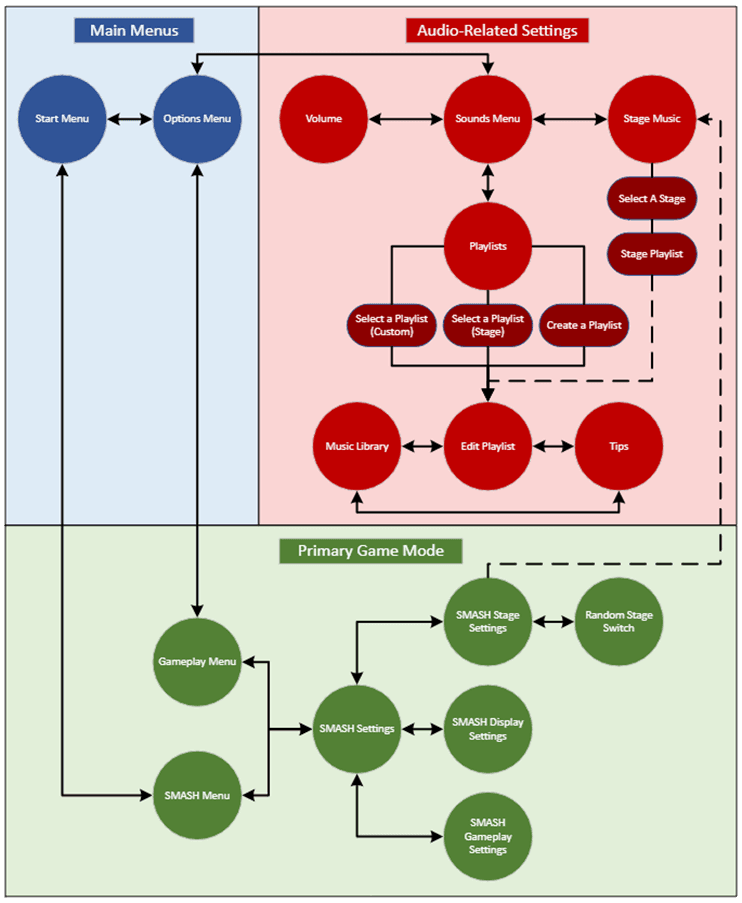
In order to focus on detailed menu interactions, we narrowed our testing material to three flows:
Main Menus
Audio-Related Settings
Primary Game Mode

Key features…
Grid layouts
Carousel settings

Music customization

First round of testing
resulted in mixed reactions to the interface.
Based on the analysis of the qualitative and quantitative data gathered, it became clear that there are multiple issues with consistency, guidance, and the structure of the settings menus in the commercial game.
Round 1
|
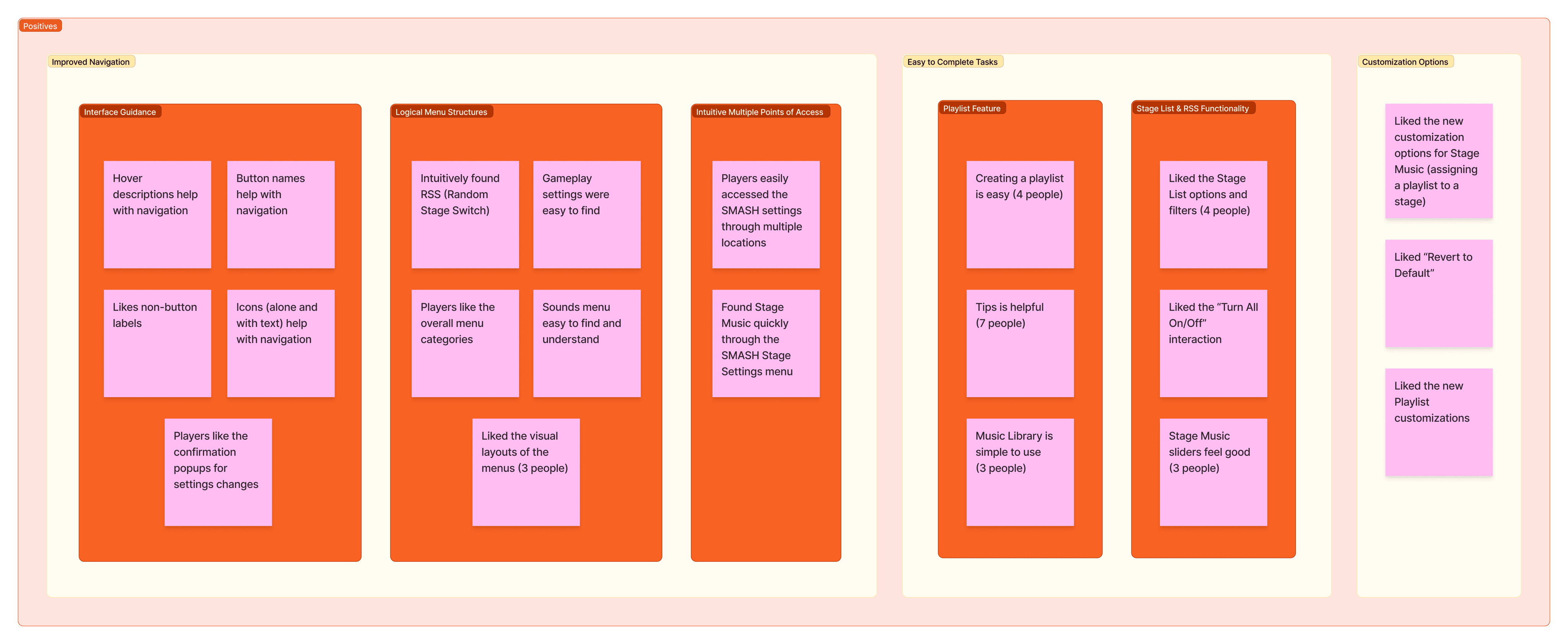
Affinity Mapping
Round 1
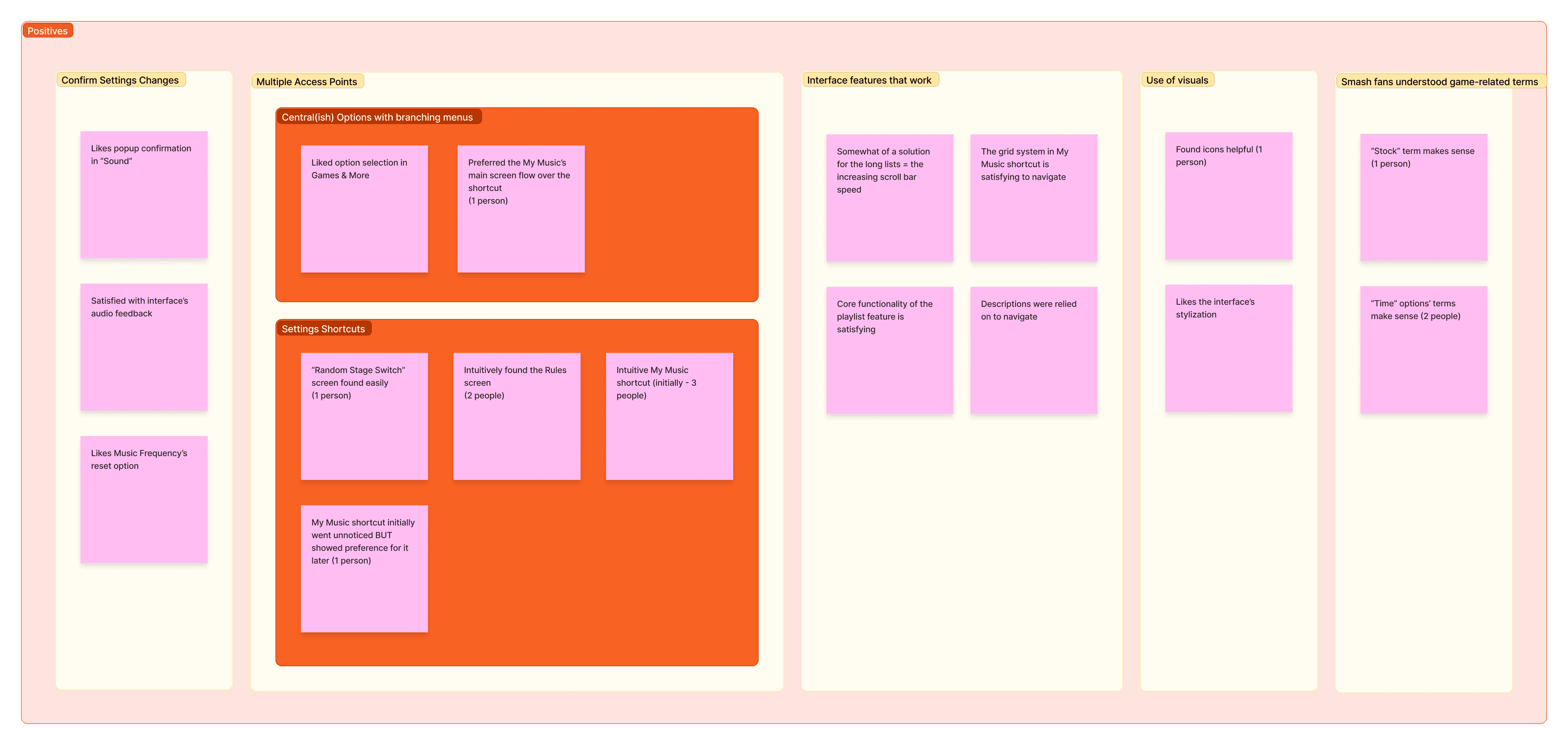
|
Participants liked...
Information and feedback
In the form of confirmation pop-ups when making a settings customization change.
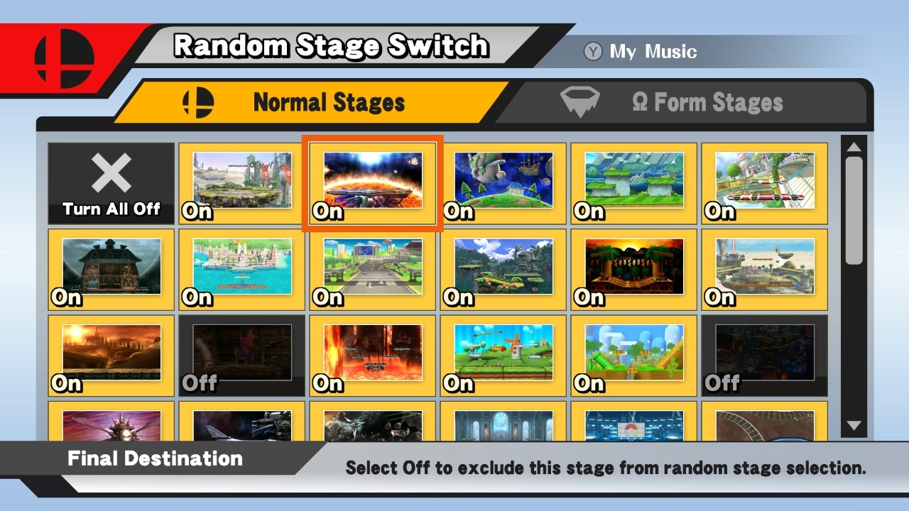
Central hubs and short-cuts
To quickly access all different types of settings without getting lost in nested menus.
Music player
The basic functionality of listening to music and creating an in-game playlist.
Round 1
|
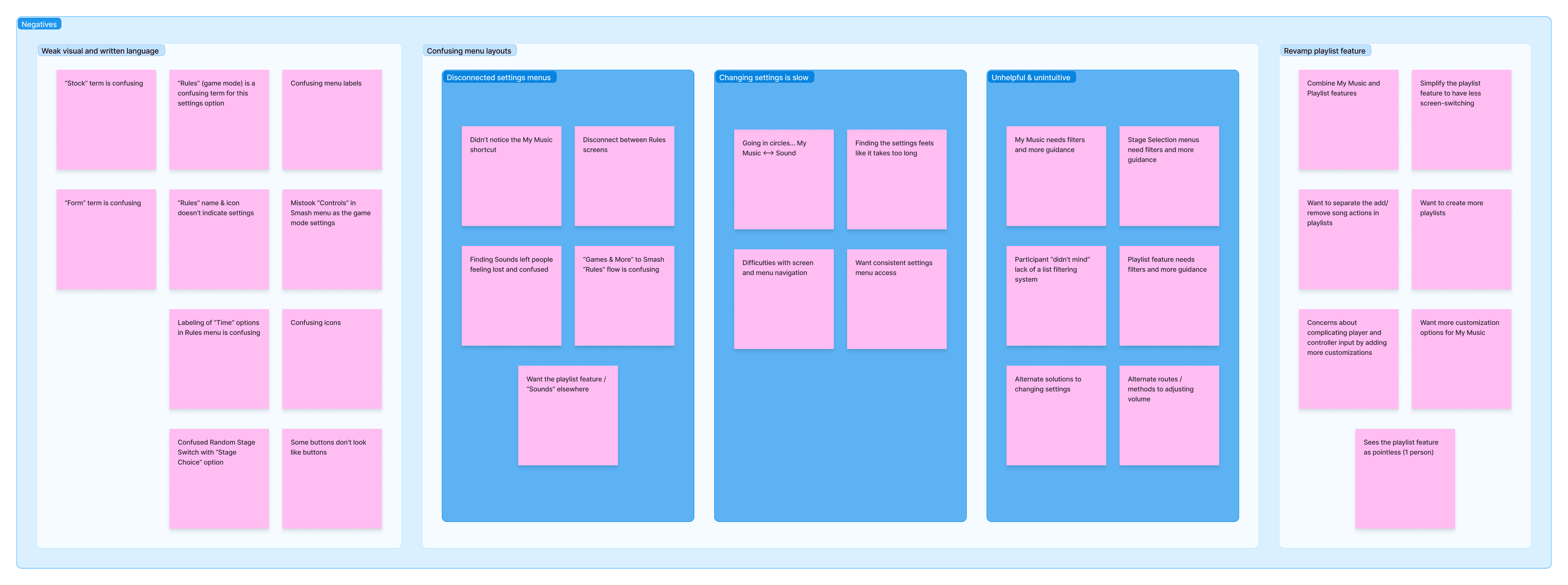
Participants disliked...
Inconsistency with the positives
Interface guidance implemented sparingly and limited customization options.
Visual architecture of the menus
Difficulties with navigating the layout of buttons on the screens.
Before redesigning the interface,
I applied the principles to this data.
The next step is to analyze these positive and negative observations through the lens of the two principles and their components. This way I’m better able to understand WHY these complaints are happening- which makes the next step of redesigning much more efficient!
This process involved two steps…
Identify the complaint or approval.
Reframe using one of the components.
An outline of specific elements to be redesigned is created by executing this process.
Complaint
Players want to be able to create multiple playlists according to specific moods, which the commercial game doesn't allow players to do.
Analysis
There are flexibility limitations negatively affecting the players’ experiences with playlist settings customizations.
Principle
Flexibility in use
Component
Customizable

The redesign process
went through several iterations.

First settings menu iteration
This first approach was to mimic the top navigation often found in modern video game interfaces.

Final settings menu iteration
A central hub would need to fit many different settings categories, so this upper level button layout was the best choice.
Establishing a consistent grid system and menu layout was the main focus of the earliest stages of redesign. With this new visual hierarchy as the foundation, other changes were then incorporated based on the problem areas found in the gathered data and principles analysis.
The final prototype included:
One central hub to access all settings in the game.
A new hub for gameplay settings with redesigned nested menus.
A new hub for sounds settings.
An expanded music player with the ability to create and manage multiple playlists, which can then be assigned to any in-game level.
A look at the final prototype:
the Main Menus flow
Second round of testing
resulted in more defined pain points.
Usability interviews
Talk-aloud method
Post-interview survey
After conducting another round of interviews and collecting survey responses, the data shows an overall improvement of the user experience with this redesigned interface. Addressing pain points going forward will be much easier using this data to make intentional changes to the redesigned interface.
Round 2
|
Affinity Mapping
Round 2
|
Participants liked...
Navigation
The new central hubs acting as shortcuts were easy to navigate.
Functional interactions
Interactions with the interface and new features worked as expected.
New customization options
Overall well received and felt accommodating to the participants.
Round 2
|
Participants disliked...
Visuals and layout
Low-fidelity design of the prototype was a weak area in creating a positive experience.
Information hierarchy
Groupings of ideas for the gameplay settings were confusing.
Vague guidance
Hover descriptions were still confusing for some participants.
Function and access limits
Participants felt new features could still include more customization.
Yes, design heuristics work!
Now what?
After completing A/B testing, the final analysis of the qualitative and quantitative data reveals two main areas of improvement:
Flexibility of customization
Simplicity of navigation
Despite time restrictions limiting the development scope of the prototype, the redesign of the game's information architecture and customization options was successful with the help of the universal design principles!
What does this mean for GURUX? Design heuristics work! With further research and iteration, more game development teams could design and launch consistent user experiences with the help of an industry-standard set of design heuristics.